Mr. Baby is baking in his tummy oven and we have a lot to do on our end to turn our guest room into his future bedroom! We're taking you along on the whole journey of concept, design and execution for our nursery! Joey and I both love the idea of a gender-neutral, enchanted forest look with some animals around but of course, keeping it chic and well-designed looking and, very importantly, easy to clean!

This vibe tray above is a physical representation of the feeling we want to achieve in the nursery. Forest green and neutral tones with accents of wood, faux fur and mixed metal.
 We want to install wainscoting moulding throughout the room to give it a more designed, clean look. (see how we did this as a DIY in Meghan's room) The functional benefits of the moulding are that we can paint it with a semi-gloss finished paint so it's really easy to wipe clean with a damp rag. Also I plan to use the wainscoting for wall storage by adding hooks for baskets and frames for his artwork or a sensory board when he's ready for that, etc.! See below for my ideas for those, which Joey will build! I also plan to hand-paint a mural above the wainscoting of a forest with a few animals peeking in to the room and maybe even add some faux fur to those animals to make them interactive and tactile, because #whynot!?

I always like to create a shopping board of the items I'm planning to buy online so I can see how they play together, how cute is that rattan crib!!!?...

And this is the floorplan we're thinking for the nursery because we want a way to keep a fold-out sofa bed in the room for guests since we live in a two-bedroom house!

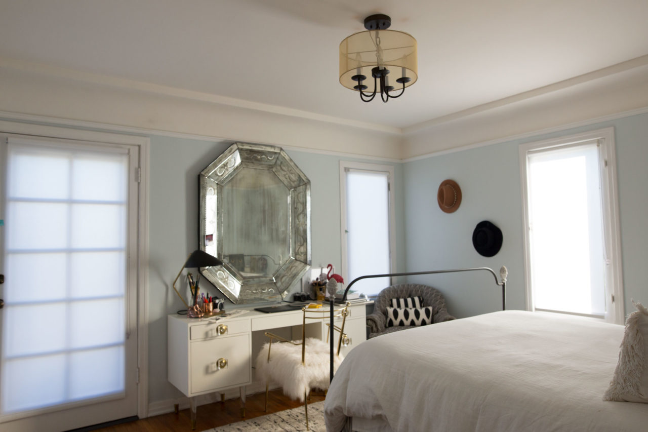
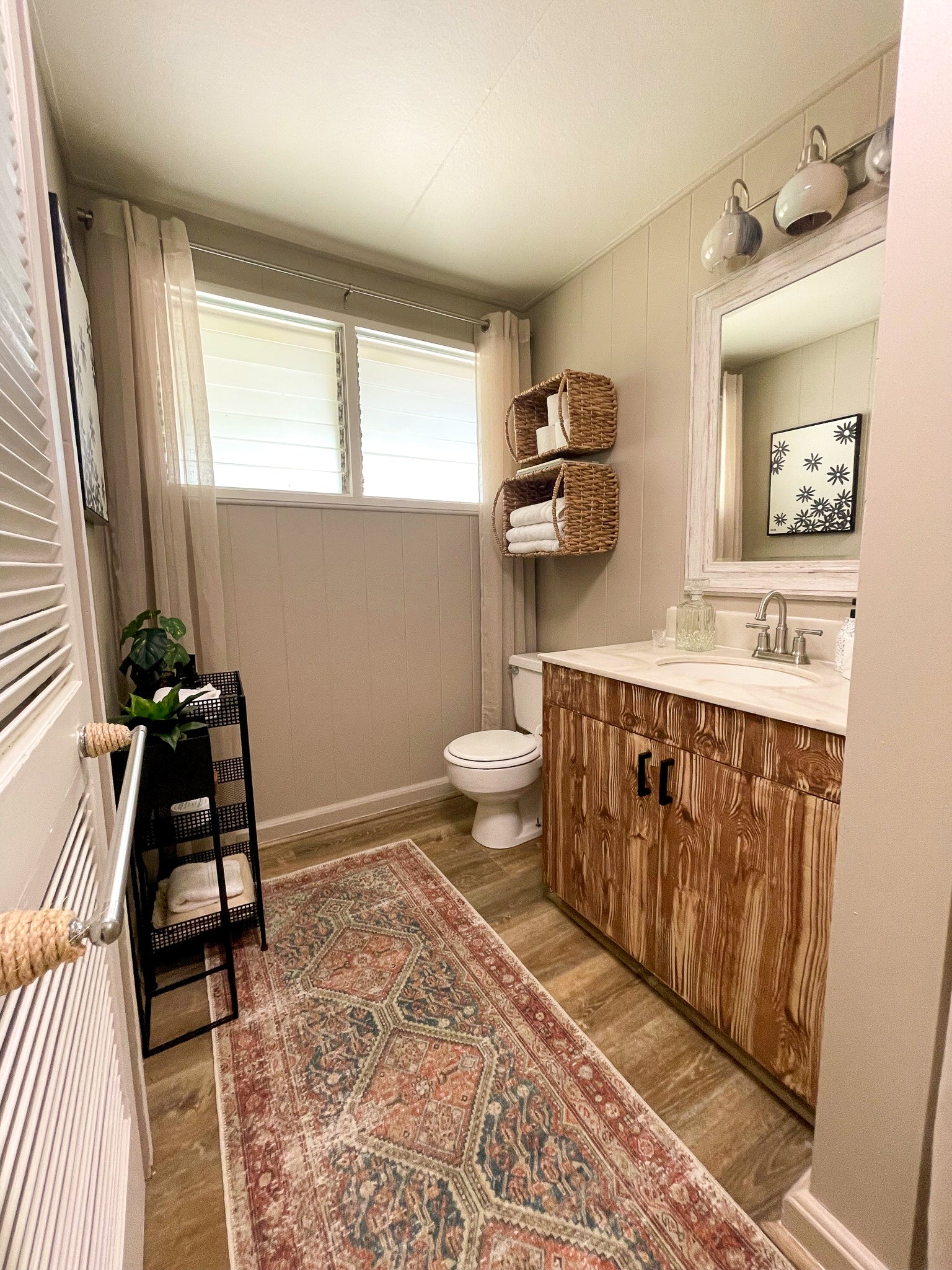
The BEFORE photos of our guest room. This room became a kind of random design because we kept changing it up and we just use it as a room to shove stuff that we want out of the way. It is really in need of a makeover!


Lots to do! Let's see if we can make it look as cute as I think it can look in time for Mr. Baby to arrive!


