Fun fact: I am an artist. Funner fact: you are, too! Whether you're equipped with a framed design school degree or just a sharpie, when mid-afternoon boredom begets a case of the doodles, all artworks are created equally. I'm a huge fan of using art to help fill a space with personality — I mean, what says you better than your own handiwork?! To prove this point, I invited my friend David Bromstad — HGTV star, painter, and human unicorn emoji — to partake in this extra special episode of Mr. Kate Decorates.
As you'll see in the video, David and I each painted our very own masterpieces (him using his signature color drip technique, and I using the text art I've grown so fond of on my instagram and in A Hot Glue Gun Mess), and decorated sitting room spaces around the individual artworks. It was so much fun to see how much an 18x24 canvas could transform a space, setting a tone and color palette, and leading the way for the rest of the decor. But it was also a lot of fun to see (and show) that any kind of art is perfect to put on your wall and decorate with! David is a professionally trained artist, but I sure as heck am not, and it didn't matter! Art is so individual, as is design, and there is no such thing as wrong (just don't eat it, it doesn't make for pretty poo poo).
Check out the video above and some design tips about David's and my spaces below!

And AFTER x 2!...

David's Room
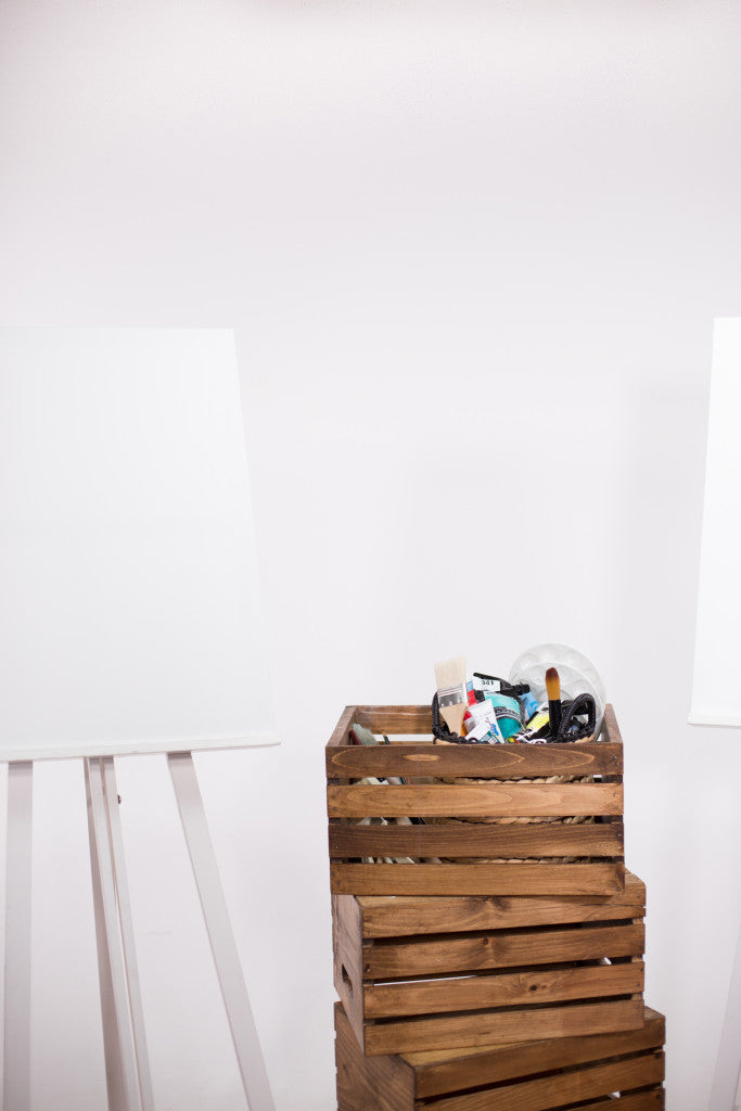
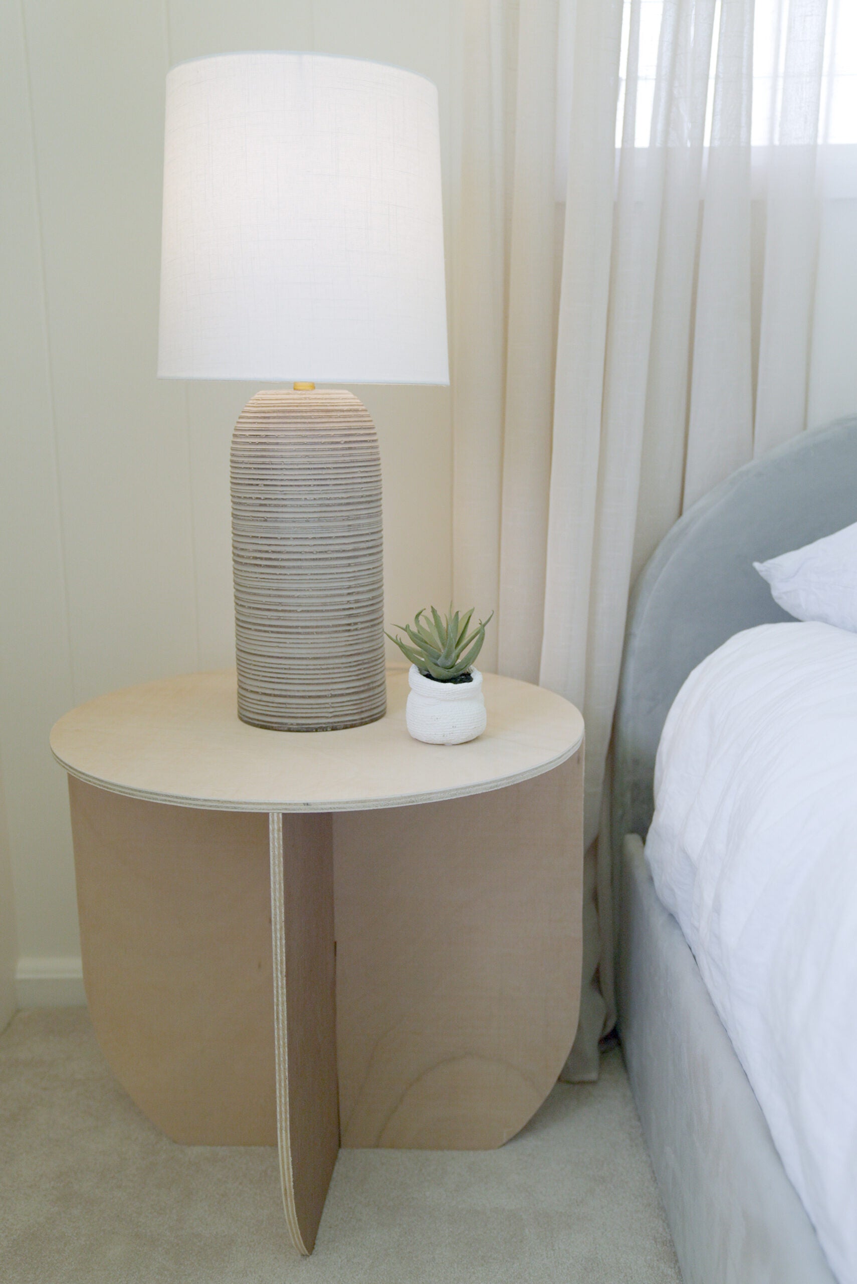
I love how this space came out. It really reads as fun and unexpected and irreverent — which is David in a nutshell! Instead of using one side table, David paired two for dimension and even more opportunities for decorative accessories. Speaking of, you can see David's love of color (his show was called "Color Splash," after all) in the pops of pink, green, and yellow he chose to use — which all called out to the hues in his painting, as well! One last tip from David's room: stacking crates is a great way to add architectural interest, height, and utilize wall space. All together now: saaaaaaahcute!

My Room
My painting is more minimalist (with the color palette, at least) but sets a tone of carefree vibes with the "I do a thing called what I want" text. This allowed me to lead the color story of the room with decorative accents instead. I chose a deep blue (that you can see in a vase, the small skull, and the indigo pillow) with the natural green elements (a must-have in any room I decorate!) and a touch of muted aqua which works because it's in the blue family. These cool tones, mixed with muted golds, brought a fresh sophistication into the space, which nicely balanced my cheeky wall art! I also mixed prints with the pillows which brings a complexity and eclectic flourish to the design. Where as David stacked crates against the back wall, I used a bench instead with the crate turned the other way to form a shelf. I love using a bench as a side table, it's unexpected and gives you more surface area for levels and styling.


He's sooo cute, isn't he!?


Would love to hear from you in the comments! xo


