Welcome back to Design Vs. Design — a series that challenges two #creativeweirdos to step into mine and Joey’s shoes to design and decorate a room in under two days! The contestants have free rein to shop at Living Spaces, plan, paint, and DIY with a certain theme in mind. But this episode is special for two reasons:
- It’s the first episode with kid contestants! Dalya and Jordan, our designers, are only 13 and 14 years old!
- The challenge for this episode is to design a bedroom with a statement wall. If you’re familiar with my work, you know that the statement wall is a signature touch I come back to a lot in designing. It was so fascinating and inspiring to see these girls’ takes on it!
Watch the episode above and see the creative process behind these two amazing children’s rooms below!
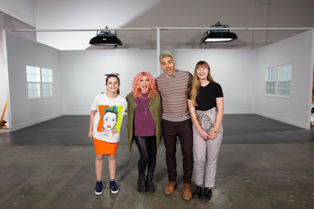


Right away, the two girls opted for very different themes and color palettes for their statement wall challenge.

Dalya went for a split wall like we did in LaurDIY and Alex Wassabi’s office, with a paint drip detail a la Jessie Paege’s apartment, while Jordan used a city landscape as mural inspiration, which is reminiscent of the Houston mural we did for Liza Koshy!


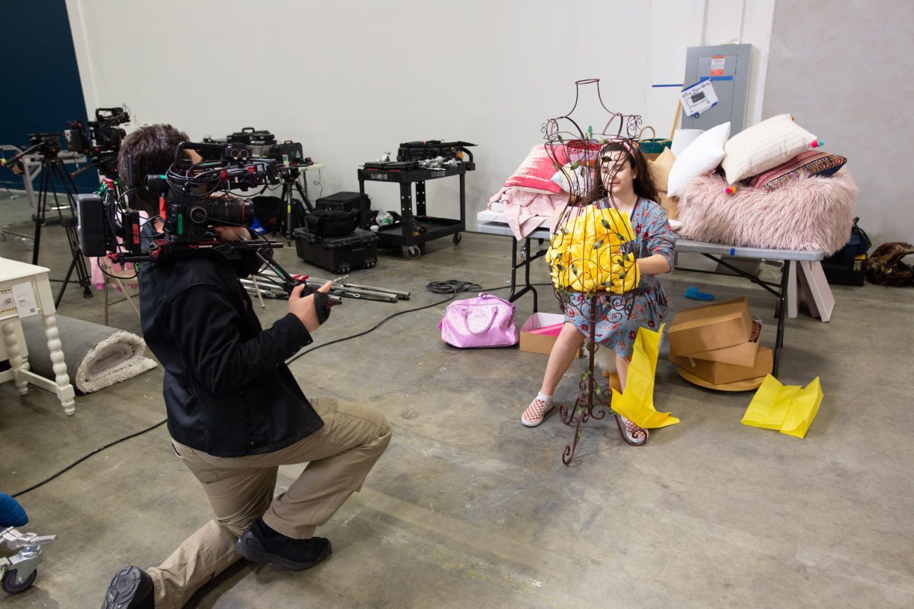
Each of the girls put so much attention to the details in their room. Dayla was super focused on balancing out the colors in her space and bringing in a lot of DIY moments like the tissue paper-filled wire bust above …

While Jordan meticulously edited her accessories to tell a very sophisticated and beautiful story of a love of travel, with some Southwestern vibes mixed in throughout.
Let’s take a look at Dalya’s bright and bubbly room …


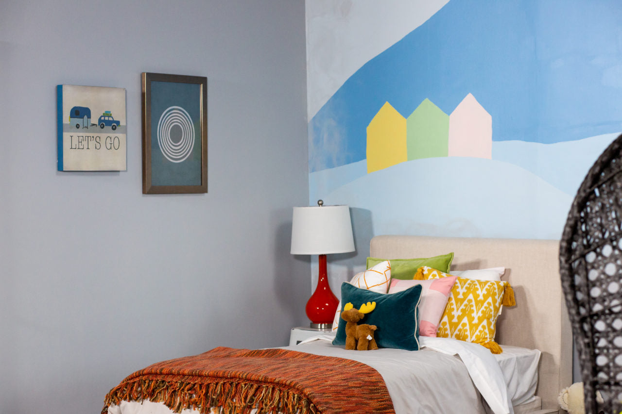
Now let’s take a look at Jordan’s adventure-themed room!




Our esteemed panel of judges — Alisha Marie, Amina Mucciolo, and Drew Scott — took a look through each of the rooms to get initial impressions before meeting and chatting with each contestant!


Then they deliberated and decided on a winner …

Who was …

Dalya!! She won the judges over with her innovative DIY-ing and thoughtful touches in the design. Congrats, Dalya! We all loved you colorful room!

We absolutely loved and were so impressed with Jordan’s room as well! The best part is that both of these rooms are being donated to charity, so their amazing design and all those special touches live on!


